Here at Shipman Studios, one of our specialties is composite portrait photography. While this style is often more of a commercial photography application, it’s also a dynamic way to build custom portraiture for our high school senior clients too. Composite photography simply means that the final image includes one or more previously unoriginal elements. That may mean putting something in that wasn’t previously there, or it may mean taking something out of one image and blending it into another one.
When building something like this it’s critical to use elements that look like they could go together. So if for example we are shooting a portrait client in our studio with the intention of compositing them into an urban background, we need to know ahead of time what background we plan to use and examine it for viewer perspective, lighting angles and other environmental elements that would affect the subject, if she were actually there. When finished, a composite only works if the brain can look at it and be convinced that all these things match. If any of them don’t look right, you don’t have to be an art critic to see that something is off, even if you can’t specifically state what it is. For this project we are compositing a studio portrait subject into a sunset backed field of sunflowers. This is the licensed stock image I found and selected for the project.
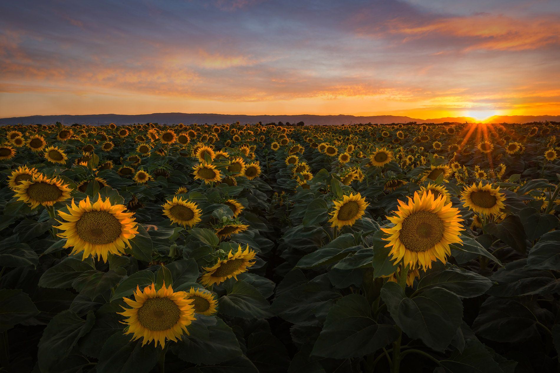
Our subject for this project is our lovely senior portrait client Taylor Riley, a cheerleader from Owasso, Oklahoma. We had already shot several on-location portraits in downtown Tulsa and at a nearby park, but a few of her specific requests could only be accomplished by shooting in our studio. The fact that it is 20 degrees outside in mid January and the request was for a scene in a sunflower field meant that we could either wait 4 months and find a blooming sunflower field, OR we could just shoot a composite in our nice warm studio!
So, after knowing we would put her into a backlit sunset scene, we knew how to position lighting for the shot to match it’s destination. Getting a properly lit shot from the correct perspective against an extractable background is essential. To that end, we started with this image in camera, upon which we did a very basic retouch and portrait edit to prepare it for extraction.
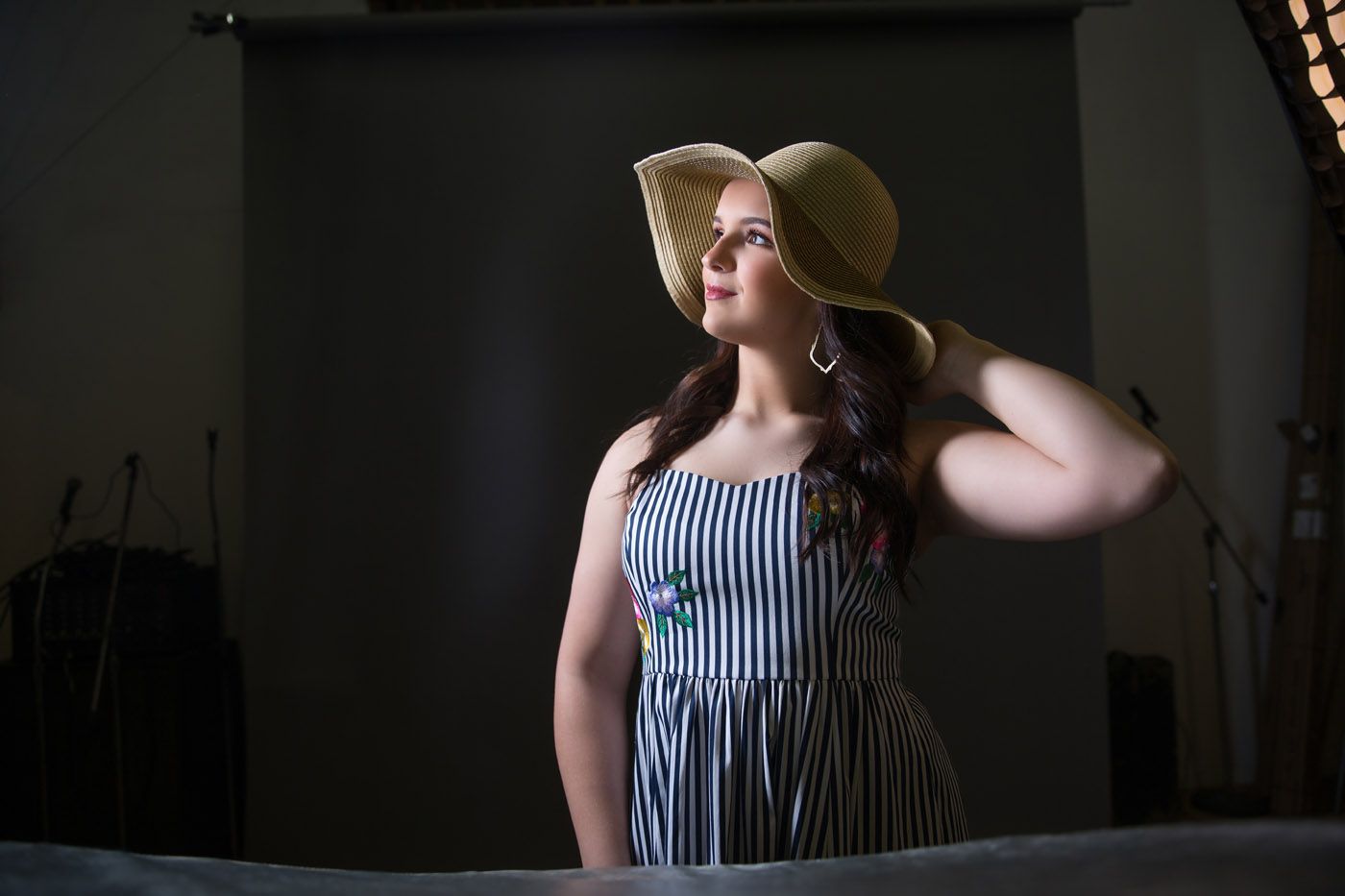
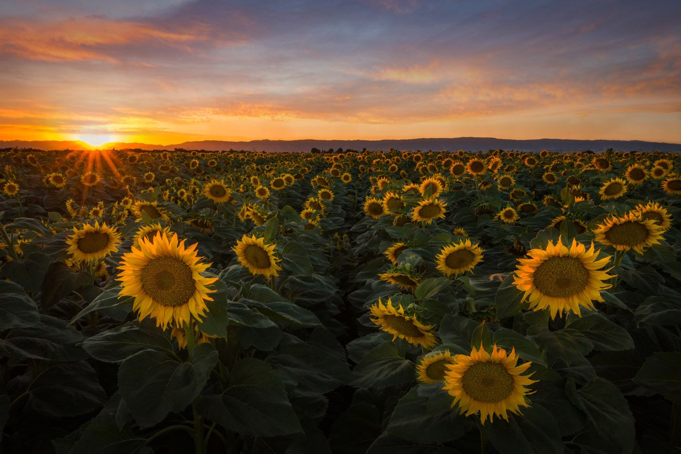
This is the side I preferred of her for the shot, but this puts the sun on the wrong side of her to be naturally lighting her face up, so the first thing we did was flip the background to put the sun on the side of the picture that would naturally have lit her face.
Next comes the extraction. In the past, I would more often shoot subjects on a traditional green screen in order to get a good extraction, but over the years I’ve found that I prefer shooting on grey backgrounds because they tend to have less color contamination to deal with. What it always comes down to is getting a clean selection with as much hair detail as possible. The specific techniques I use to get a perfect selection we will address in a future blog, but for the sake of demonstrating how this image was built, this is the selection we used.
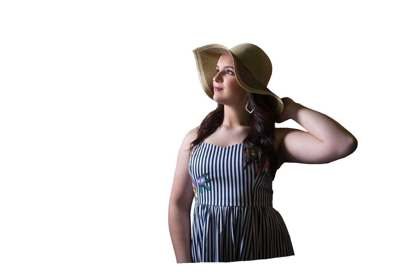
In this case, there isn’t a lot of exposed hair edges to worry about, so it was a pretty simple extraction. After creating this extraction comes one of the more fun parts of the project – the moment you first introduce the two foreign images together and place your subject where you want them to be. The placement I use is based on serving the final image. If there are multiple subjects interacting, I will have storyboarded and sketched it out to accommodate that. But in a portrait situation, it comes down to the basic artistic composition. In this case, with a horizontal cinematic scene, I used the basic rule of thirds method – placing our subject on the right-hand third of the picture with her head being at the intersection of the top third. I will do a future blog post on rules of composition and when to break them, but for this project, the rule of thirds was the right call. Here is the unblended composite of the two images.
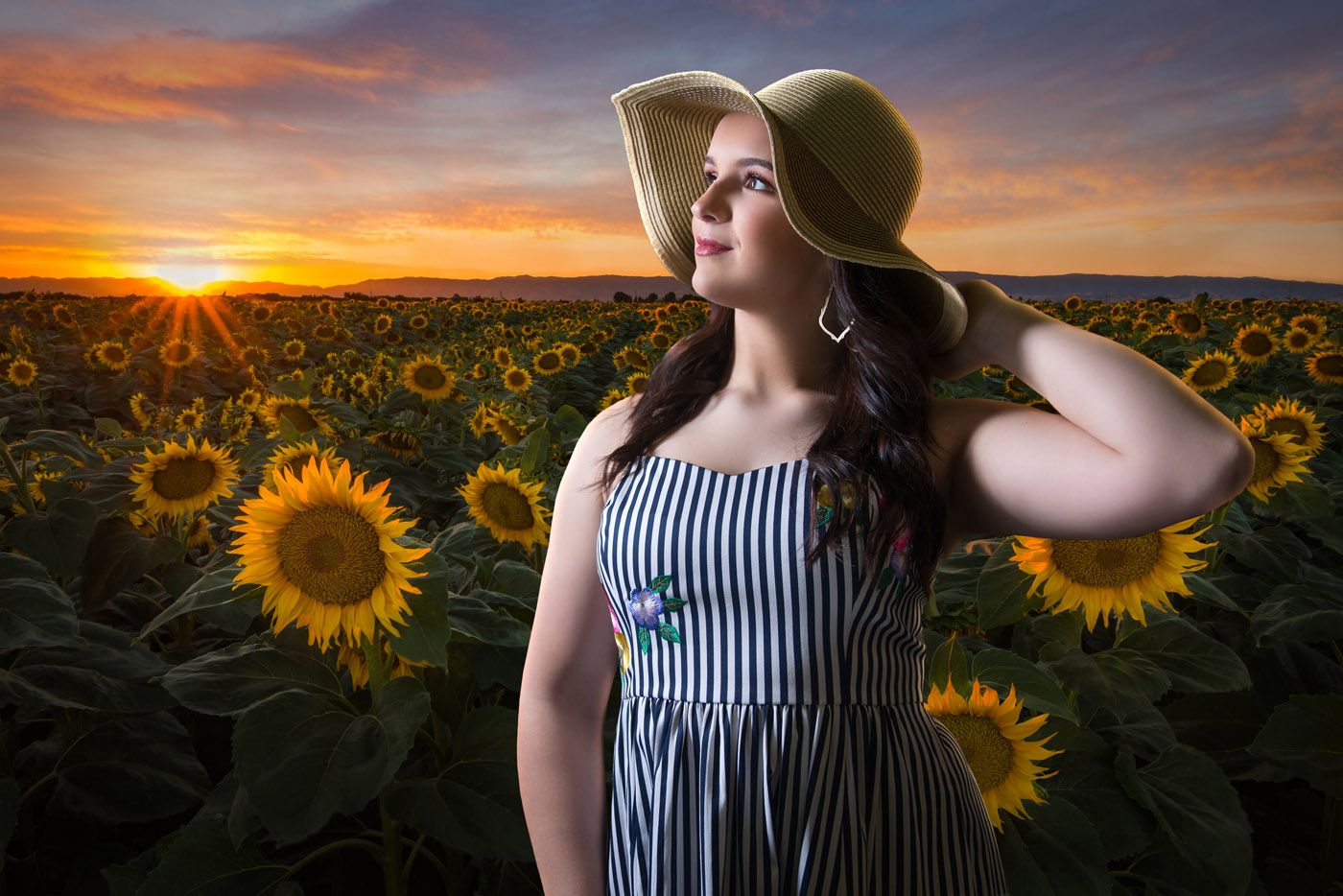
Now it’s starting to take shape! Not bad as it sits. The perspective from the viewer’s point of view of both the girl and the field works. They look like things that would be on the same plane on the same line of sight, with correct sizing and spacing. The light from the sun appears to be in the right position to light her face, and the light wrapping around her hat and left arm are what you would expect from a backlit subject. That edge lighting is partially real (backlit in the studio) and partially artificial (future blog tutorial).
So,the perspective works. The lighting works. What doesn’t yet work is blending. If she were lit by sunlight, she would be a little warmer and pick up some of the ambient light tones in the sky in the field in her skin. Right now she feels like while she might actually be there, she’s artificially lit. So let’s warm her up and blend her lighting.
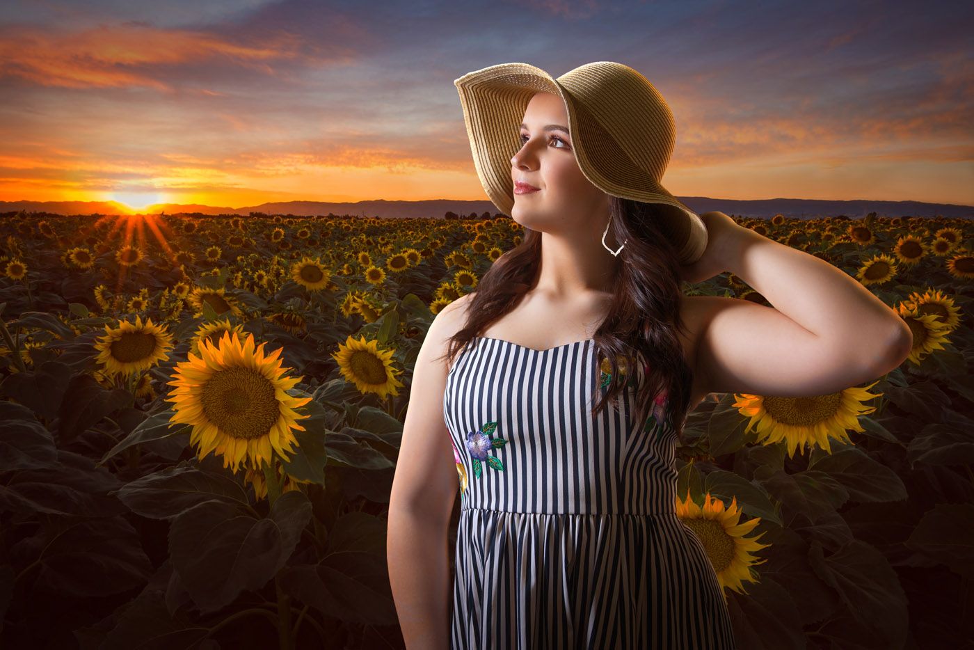
This is also where we start color grading the whole scene. One thing that helps a composite be believable is similarities in the colors evident in the shadows. So after warming her skin tones up a bit, we added a touch of red in all the black channels for both the subject and the background creating a very slight feeling of haze and matting that affected both elements of the composite. So it’s coming along together nicely! It was at this point that I had the idea that if there were some foreground element that seemed closer to the camera than the subject, it would add depth and distance to the scene. So… I carefully selected the large sunflower to the side of her right arm, enlarged it, copied it and made two big (close to the camera) sunflowers to add to the shot and create the feeling of being IN the field instead of just in front of it.
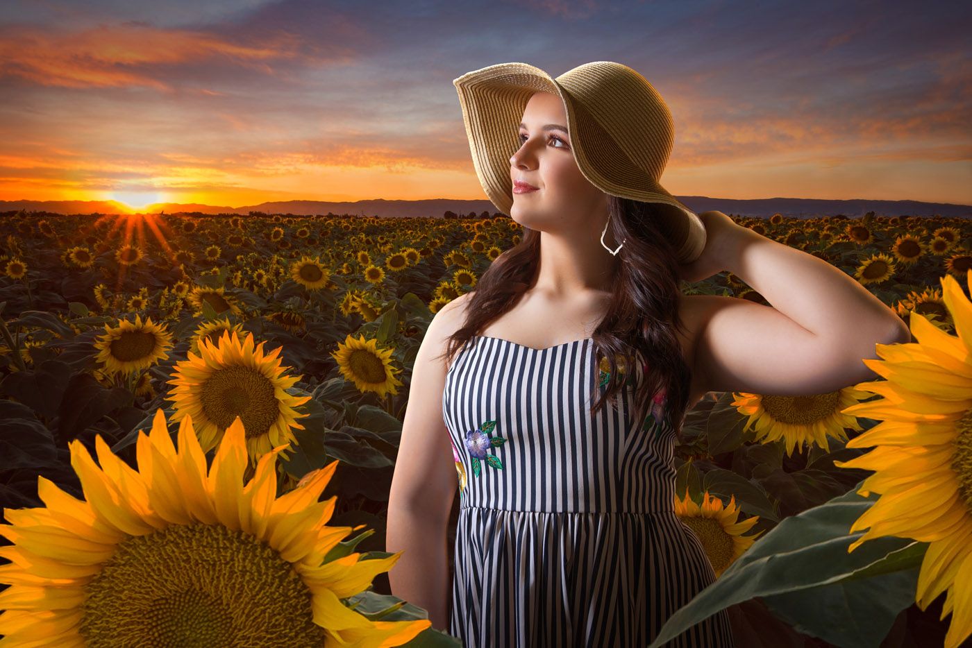
Well, that really woke the picture up! When doing composites it’s dangerously easy to get too enamored with what you can do in a powerful program like photoshop, and it’s important to know when to quit. We aren’t there yet, but the finish line is now in sight. Next, we need to create some more lighting dynamics and add more haze that will affect all (now) four elements of this composite.
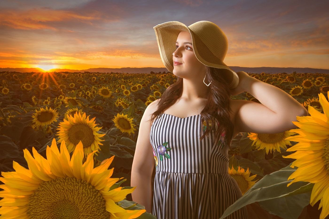
Here we have added a little more haze over the top of the whole scene to create that soft sunset light that you notice when looking at anything backlit by a sunset. This time of day, the sun would be at a low angle, filtering through layers and layers of atmosphere and dust creating that ‘golden hour’ light. A haze helps sell that, plus it’s an effect that goes over all the elements which give a degree of sameness to them all – helping sell the illusion. The next adjustment is my favorite… It’s the secret sauce for this particular scene.
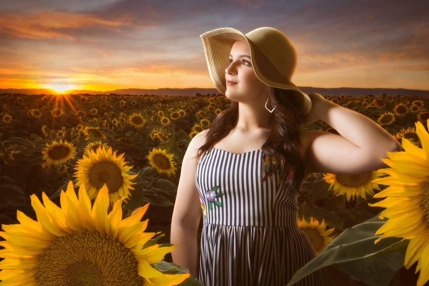
It’s subtle, but if you compare it to the one just above, you’ll notice this image is softened and just has a bit of glow to it. The golden hour is a magical time, and a little softening of the overall scene helps sell the warmth and mood. Now to liven up the lighting dynamics…
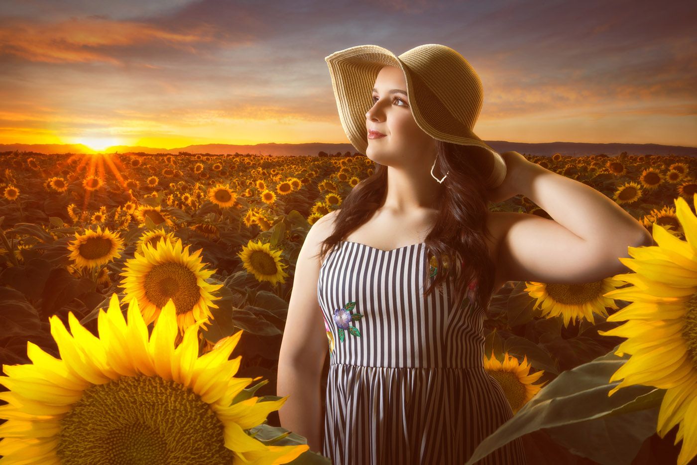
Here we hit the highlights of the flowers with some dynamic lighting effects which help them appear to be more vividly lit from behind by the setting sunlight. Simple but helps the image become livelier and gives it more energy and warmth.
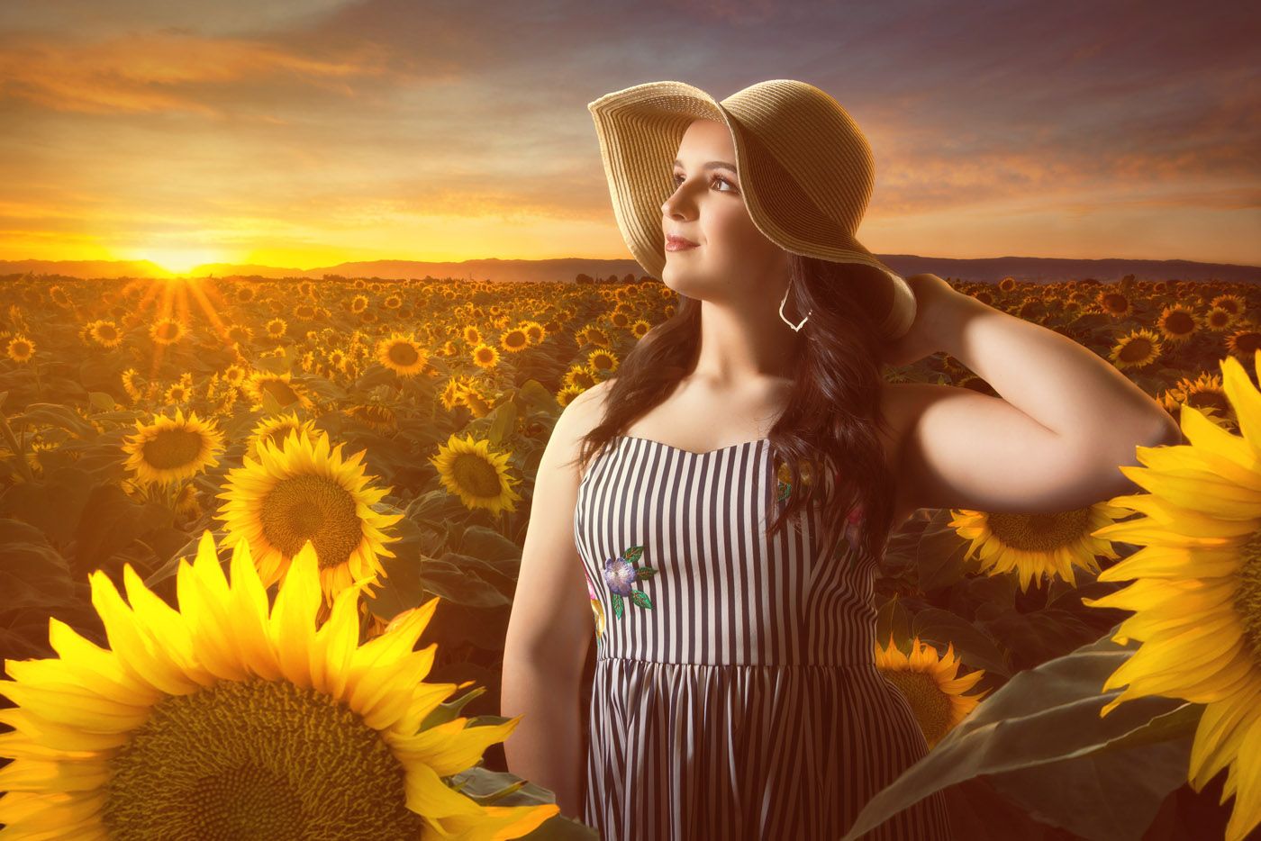
And finally, I add some thicker haze in the direct line of sunlight and then perform one final color grading adjustment that affects the whole scene – taking just the slighted edge off the yellows so they don’t feel too overpowering and this is the final edit of this Composite Portrait Photography.
Thanks for reading this blog! We plan to start doing weekly installments of our www.shipmanphotos.com blogs. Please let us know what you think and let us know if you have any requests for future blogs, and be sure to visit our senior portrait information page HERE.

